By Erin Poulton
Abstract
This article is based on segments of All About that Baseline Experience; a presentation delivered at Interpretation Canada’s annual conference in September 2020. Part 2 explores the development and application of graphic standards to ensure ongoing interpretive cohesion within permanent exhibitions at the Canada Aviation and Space Museum. Part 1 can also be found on this blog.
Article

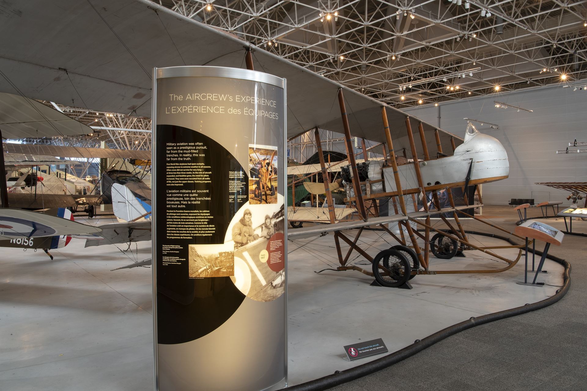
A portion of the museum’s First World War area, highlighting a newly-developed thematic panel. (Credit: Erin Poulton)
The Canada Aviation and Space Museum (CASM) has recently developed graphic standards with the aim of increasing the overall cohesion of our interpretive approach. The document includes a breakdown the main panel types that will recur in the museum’s open-concept Main Exhibition Hall, and parameters for their content, design, and layout. In developing our approach, we knew that full-scale gallery redevelopment wasn’t possible—we didn’t have the time or funding for a project of that scale.
Accordingly, we needed a phased plan that would allow us to:
1. Execute our updates by means of existing remedial priorities (i.e. replacing missing or damaged exhibitry);
2. Minimize costs by retaining exhibitry that is objectively ‘in good shape’; and
3. Ensure in turn that new panels coexist smoothly with existing ones as we cycle through remedial work over the long-haul.
In developing the graphic standards, our first step was to take stock of all panels within the Main Exhibition Hall—categorizing them, and planning for their retention, adaptation, or removal. To simplify this task, we found it helpful to ask ourselves some guiding questions:
- How many different panel types (or purposes) can we identify?
- How many different styles of panel are used for each purpose?
- Which panels share a design treatment that makes them read as a “family”?
- Within these families are there recurring patterns (writing style, graphic approach) that help visitors navigate the content?
- Does one family grouping show the least wear or damage?
This list is not exhaustive, but was a good starting point in assessing which “families” of panels were the most effective and worth retaining. We also conducted visitor testing to challenge our assumptions before proposing any changes. Our new graphic approach drew inspiration from our most successful existing panels, incorporating key features such as shape and colour while improving accessibility and readability. This enabled us to move towards greater overall cohesion while still combining older and newer panels within the same space.
As we kicked off our remedials updates, our first focus was the low-hanging fruit: artifacts with missing or temporary signage. We retained one existing style for our basic caption panels, adding new panels where required that were larger and easier to read. In time we will transition to the new panels throughout, but in the meantime, we can save costs by retaining one style of existing panel until the end of its lifecycle.
From there, we began to address our ‘consoles.’ These large back-lit panels tell the story of each aircraft on display. When we began this update, many of our console panels dated from the museum’s opening in 1988. Over time, past remedial updates disrupted the overall interpretive flow by introducing different graphic approaches. The console updates are ongoing, and we are taking a two-fold approach:
- When we replace a console in a thematic area that we cannot yet fully update, our graphic style is heavily influenced by the original 1988 panels (which still make up a slim majority in our Main Exhibition Hall).
- Where we are able to fully update a thematic area, we transition to a new “look” that includes larger panel structures and a more timeless design. We also incorporate a new layer of interpretation—thematic panels that present background concepts to non-expert audiences.
Once again, this approach enables us to gradually transition to a new style without disrupting the flow within existing areas.

An example of the museum’s original console panels, dating from 1988.

A new panel, for use alongside older existing panels.

A new panel, for use in a redesigned section of the museum.
Overall, we are finding the graphic standards to be a helpful tool for implementing remedial work, guiding exhibition development, and envisioning long-range plans. Having standards in place is helping us to take one-off projects—the type that could once obscure our main messages—and shape them into novel experiences that complement existing learning objectives. Part of this success involves fostering buy-in within our museum. If colleagues can reasonably argue that they can’t follow a plan, it will lose momentum—so we’re striving to keep things flexible and attainable. On that note, we wrote the standards in such a way that they are only prescriptive where truly necessary. This leaves project teams with clear boundaries, and room to innovate. Similarly, support from leadership is also crucial for long-term success. Over the past decade the CASM’s leaders have been committed to updating our baseline experience to better serve family audiences—but these are the same leaders who have to make difficult decisions about how we spend our time and money. Our commitment to finding phased approaches, and overlapping updates with required remedial work, has helped our leaders to see that updating the baseline experience doesn’t conflict with their other goals. Over time, we hope that this approach will enable the CASM to shift with intention—making strong strategic decisions that enable us to stretch our resources while providing visitors with the clearest and most engaging experience possible.
Erin Poulton is the Exhibition Interpretation Officer at the Canada Aviation and Space Museum. She has been working in museums for twenty years, with experience developing and coordinating a wide range of exhibitions, programs, educational resources, and events. A skilled communicator, Erin approaches her work with a balance of critical thinking and creativity.