By Erin Poulton
Part 1: Identifying Obstacles
Abstract
This article is based on segments ofAll About that Baseline Experience; a presentation delivered at Interpretation Canada’s annual conference in September 2020. Part 1 explores the importance of maintaining graphic cohesion and message hierarchies within exhibitions, proposing graphic standards as a tool for maintaining a structured approach over time.
Article

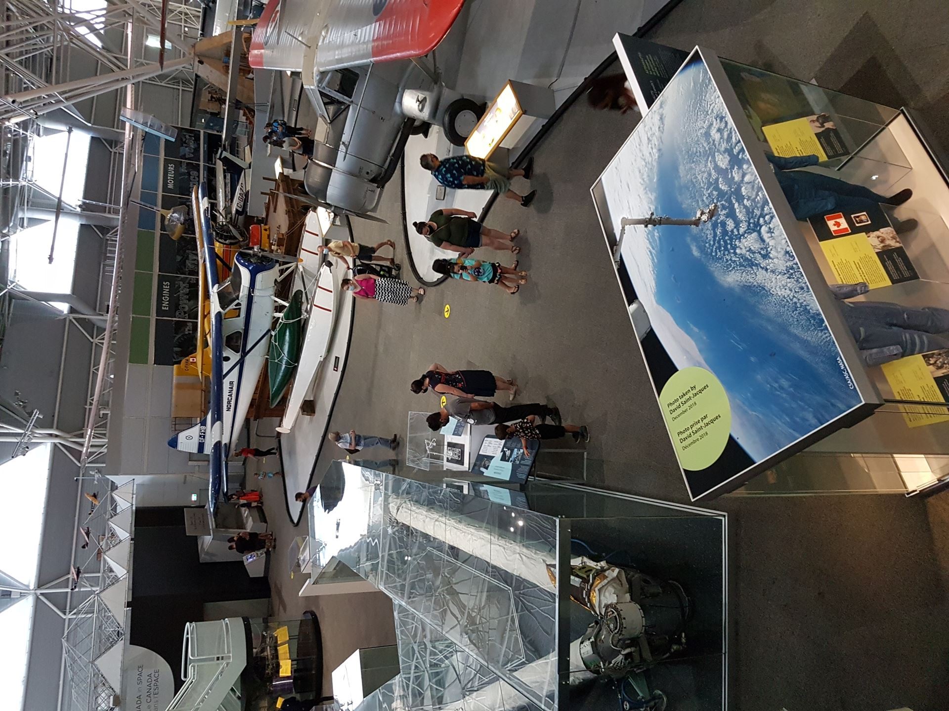
Main Hall with Canadarm - Part of the museum's Main Exhibition Hall, as seen from above. Note Canadarm 1 on the left. Photo Credit: Audrey Vermette
The Canada Aviation and Space Museum (CASM) is a true destination for aviation enthusiasts. Cited among CNN’s top 20 Aviation Museums worldwide, we present a unique collection of historically significant aircraft. Visitors can see a replica of the A.E.A. Silver Dart (the first aircraft to take flight in Canada), the last remaining segments of an Avro Arrow interceptor, and even a space-flown Canadarm. While eager to maintain our cachet among enthusiasts, we have been working over the past decade to increase the CASM’s appeal among generalist family audiences. To this end, we have been adjusting the CASM’s non-personal interpretation to better serve its changing audiences.>
A major facet of this adjustment has involved examining and streamlining our ‘baseline experience.’ Consider what a visitor experiences when they visit a site on their own, without taking part in an organized program or staffed experience. Their exploration will likely involve circulating from one object or experience to the next, guided by appealing sight lines and other prominent visual cues that surround them. We can consider this to be the ‘baseline experience’—what a visitor encounters at bare minimum if they explore on their own, and don’t engage in ‘personal’ interpretive experiences. Visitors will most likely engage with the information that is physically easiest to access—typically the main recurring interpretive elements in our permanent galleries which can include higher-level introductory and thematic panels, and repeating elements such as artifact and image labels. The cues that we send, in large part through these interpretation panels, guide visitors as they select which objects and experiences will hold their attention. Our approach in developing these elements, and ensuring that they work well together, in turn sets the groundwork for an engaging and informative visit.
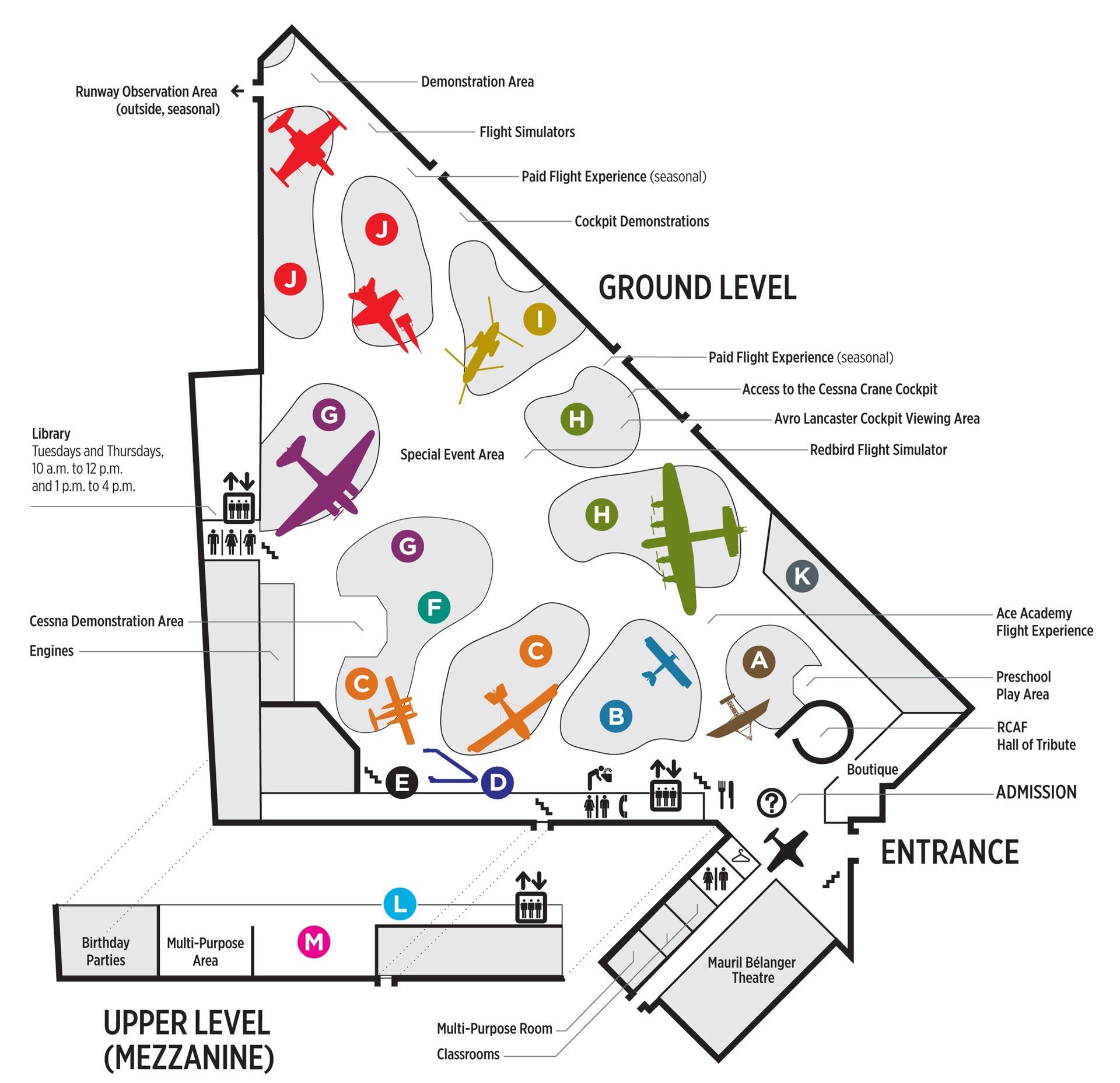
In order to set the stage for a strong baseline experience, museums and interpretive centres need to assess the baseline experience, identifying obstacles that complicate visitors’ engagement. In taking stock of the situation at our museum, it was clear that we faced a number of common challenges. The CASM is largely a hangar-style museum. More than 80% of its exhibition space is contained within the Main Exhibition Hall, which measures over 100,000 sq. ft. Content is organized into loosely chronological groupings that we call ‘thematic islands.’ With few inner galleries or wall-based displays, and sightlines from one thematic area into the next, our museum cannot have a defined circulation path<. In turn, we cannot base our interpretive through-line on the premise that visitors will encounter content in a given order—traditional introductions and conclusions are “out.”

CASM Visitor Map: Overview of the CASM's Exhibition Areas Credit: CASM
The CASM opened in 1988, and over the years there have been a number of partial updates to our interpretive approach. While there was an initial design direction for all of our main interpretive panels, subsequent updates introduced disparate approaches that eroded the intuitive connection and hierarchy among thematic panels. This was further compounded by the addition of tangential artifacts and experiences—items that were added with the intent to enrich the visitors’ experience, but which do not align with or support thematic goals within the area. Similarly, the CASM has pursued many funded “one-off” projects with the support of partnering organizations. These experiences have their own unique messages, and often a look and feel that distinguishes them as being special. While these opportunities do enrich the museum’s overall offerings, they can compete for visitors’ focus and subvert the planned hierarchy or flow of ideas within a space. These are all common challenges for museums and interpretive centres—exhibition teams are continually balancing the need to maintain and renew existing exhibitry with the push to innovate and seize new opportunities.
Over about the past decade, CASM has been working to balance these competing needs. From 2013 to 2016, we began to assess many aspects of our personal and non-personal interpretation—an initiative that culminated in a Master Interpretive Plan. Along with a focus on service fundamentals, the report set forth expectations to restructure content in ways that are more welcoming for family audiences. This involved placing greater focus on “people” and “people stories” rather than purely technology and traditional historical narratives. One of the plan’s recommendations was the development of graphic standards to bring cohesion to the museum’s baseline experience.
The graphic standards themselves cover everything from the broad to the concrete. Key items include text and graphic hierarchies, colour palettes, and graphic approaches for a defined set of recurring panel types. The idea is that panels within each area of the museum will include common elements to ensure that the Museum reads as a cohesive whole, and yet there will be variation between thematic sections to keep things interesting and help distinguish one key theme from another.
For this initiative to succeed in ensuring lasting cohesion, it needs to be different. Part of this difference involves ensuring that the document includes adequate breadth—creating rules and guidelines that won’t prevent us from pursuing future opportunities (like “one-off” projects). Throughout the document, we make the distinction between more rigid rules that apply to our Thematic Islands, and more fluid guidelines for exhibitions located in enclosed galleries (where the same degree of uniformity with the rest of the Museum is not essential). An effective standards document should be a tool after all, and not an obstacle.
The success of graphic standards also lies in their application, and in fostering buy-in for the initiative—ideas that we explore in Part 2 of this article.